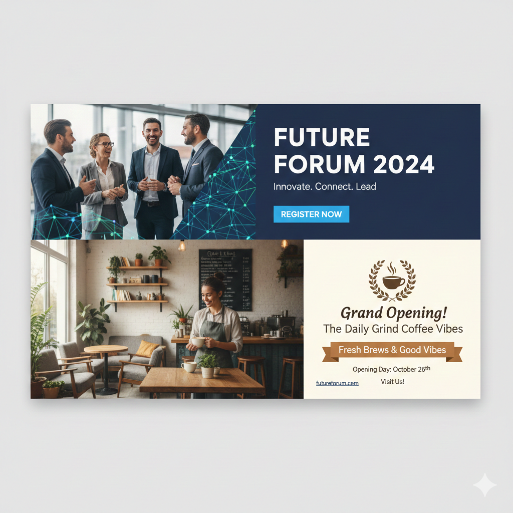
An email marketing banner is the prominent visual header (or hero image) placed at the top of your marketing emails. It’s usually a full-width image, graphic, or illustrated section that instantly communicates your main message, promotion, or brand story the moment a subscriber opens the email.
Think of it as the “billboard” of your email — the first thing people see in the preview pane and on mobile screens. A well-designed banner can make the difference between a subscriber engaging with your content or hitting delete.
Key Benefits of Using Email Marketing Banners
- Instant Attention Grabber Studies show you have about 2–3 seconds to capture attention in the inbox. A striking banner with bold visuals and clear text stops scrollers in their tracks and dramatically increases open-to-click rates.
- Stronger Branding & Recognition Consistent banner design (colors, fonts, logo placement) reinforces your brand identity every time someone receives an email. Over time, subscribers recognize your emails instantly — even before reading the subject line.
- Higher Click-Through Rates (CTR) Banners that feature a clear call-to-action (CTA) button or clickable area can boost CTR by 20–70% compared to text-only emails. The visual hierarchy naturally draws the eye to your primary goal (shop the sale, read the blog, register for the webinar, etc.).
- Perfect for Promotions & Seasonal Campaigns Launching a sale, new product, holiday offer, or event? Banners let you showcase high-quality product shots, limited-time offers, countdown timers, or festive themes in a way plain text never could.
- Improved Mobile Experience Since over 50% of emails are opened on mobile devices, responsive banners that scale perfectly on small screens are essential. A good banner keeps your message readable and beautiful no matter the device.
- Increased Perceived Value Professional, polished banners make your emails look premium and trustworthy. Subscribers are more likely to engage with (and buy from) brands that invest in great design.
- Easy A/B Testing Opportunities Test different banner images, headlines, colors, or CTAs to quickly discover what resonates best with your audience. Small changes can lead to significant lifts in performance.
Best Practices for Creating High-Converting Email Banners
- Keep file size under 100 KB (ideally 50–80 KB) for fast loading
- Recommended dimensions: 600–650 px wide × 200–400 px tall (scales well on desktop and mobile)
- Use large, readable text (at least 24–36 pt for headlines)
- Add alt text for accessibility and deliverability
- Include a clear, contrasting CTA button
- Maintain brand consistency (logo, colors, fonts)
- Optimize for dark mode (test how colors appear)
- Make the entire banner clickable when possible
Real-World Impact
Top brands like Nike, Sephora, and Airbnb consistently see 30–200% higher engagement on emails with strong visual banners compared to plain-text versions. Even small businesses using tools like Canva, Bannersnack, or specialized email platforms (Klaviyo, Mailchimp, ActiveCampaign) report similar lifts.
The Bottom Line
An email marketing banner isn’t just decoration — it’s a high-ROI conversion tool that combines branding, messaging, and design into one powerful element. When done right, it turns ordinary emails into revenue-generating experiences.
Start treating your banner as the star of every campaign, and watch your opens, clicks, and sales climb.

